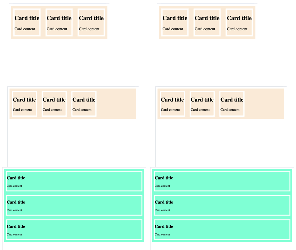
CSS Container Queries
CSS container queries allow us to style an element with regard to its parent or container size (width and height), not the viewport size like with media query.
It allow us to organize our style elements at one place and plan our layout better.
Container are better in reusability as we can name it and reuse anywhere else and it behaves in very predicable way.
html
<!DOCTYPE html>
<html lang="en">

<head>
    <meta charset="UTF-8">
    <meta name="viewport" content="width=device-width, initial-scale=1.0">
    <title>Content query</title>
    <style>
        .post {
            container-type: inline-size;
            container-name: card-container;
        }

        /* Default heading styles for the card title */
        .child {
            display: flex;
            flex-direction: row;
            background-color: antiquewhite;

        }
        .card{
            margin: 10px;
            border: solid 5px white;
        }
        /* If the container is larger than 600px */
        @container card-container (width > 600px) {
            .child {
                display: flex;
                flex-direction: column;
                background-color: aquamarine;
            }
        }
    </style>
</head>

<body>
    <div class="post">
        <div class="child">
        <div class="card" >
            <h2>Card title</h2>
            <p>Card content</p>
        </div>
        <div class="card" >
            <h2>Card title</h2>
            <p>Card content</p>
        </div>
        <div class="card" >
            <h2>Card title</h2>
            <p>Card content</p>
        </div>
    </div>
    </div>
</body>

</html>
A container cannot change its own styles but can change the style of any element inside the container.
Container-type
container-type is used to define the type of size containment used in a container query. It can accept three options:
- size
- inline-size and
- normal
Default value of container-type is normal. A container’s width can be queried with when the container-type property is set to either size or inline-size.
- size: With
size, you can query the element’s width or height, aspect-ratio, block-size (i.e., height), and orientation (e.g. portrait and landscape). - inline-size: With
inline-sizecan only refer to the width. - normal: With
normalall elements are containers by default, only they are called Style Containers and can only be queried by their applied styles. For example, we can query a container’s background-color value and apply styles to other elements when the value is a certain color value.
html
  @container card-container (width > 600px) {
            .child {
                display: flex;
                flex-direction: column;
                background-color: aquamarine;
            }
        }
// or
@container card (orientation: landscape) {
  /* styles */
}
//or
@container (10em <= width <= 20em) {
  /* styles */
}
Above queries @container card-container (width > 600px) is not possible with normal but only with size and inline-size.
Style query(with container-type: normal)
html
:root {
   --bg-color: #000;
}
@container style(--bg-color: #000) {
  p { color: #fff; }
}
container-name
The container-name property is used to register an element as a container that applies styles to other elements based on the container’s size and styles.
container-nameproperty is optional but if we leave it out, then any registered container would match when the conditions are met.
