Javascript Resize Observer
Resize Observer is the most preferred way to detect element size changes and makes changing content/styles or any custom action on a page based on resizing.
"The Resize Observer API provides a performant mechanism by which code can monitor an element for changes to its size, with notifications being delivered to the observer each time the size changes."
--MDN
Implementation
Resize observer can be implemented in 3 easy steps:
- First we should create observer instance.
javascript
const resizeHandler = (entries) => {
  entries.forEach((entry) => {
    const isSmall = entry.contentRect.width < 6;
    entry.target.style.backgroundColor = isSmall ? "blue" : "orange";
  });
};
const observer = new ResizeObserver(resizeHandler);-
ResizeObservertakes one callback function, triggers any time an element you are observing changes size it will trigger the function passed to ResizeObserver. -
Callback function has one parameter of type array -
entries. This array just lists all the elements we are observing that have had their size change. -
Each element may contain ``contentRect` property.
-
his property contains information such as the width, height, top, left, bottom, right, etc. of our element. Finally, we are using the target property of our entry to get the current element that is being observed.
Example
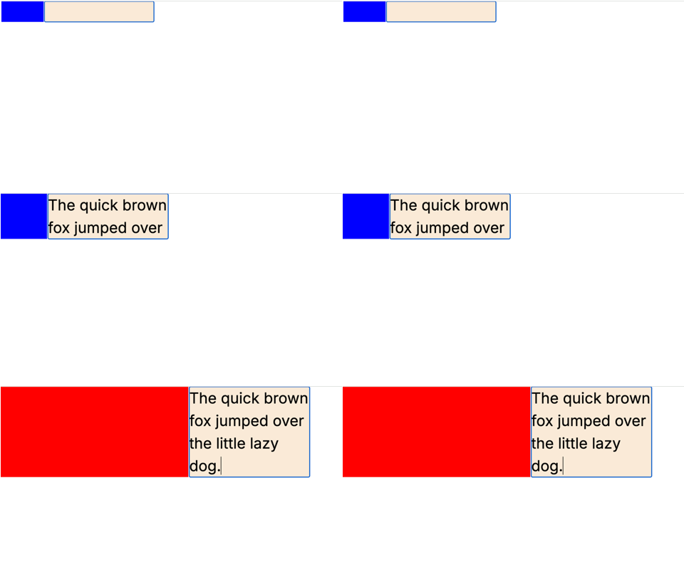
Problem statement: We are trying to create an page where:
- We'll have two div's:
html
<div id="resize-target"></div>
<div id="input" contenteditable></div>- If we enter text in element
inputand length of content reaches 50 or beyong then size ofresize-targetshould get increased to400pxand background color should get changed to red.

javascript
<!DOCTYPE html>
<html lang="en">

<head>
    <meta charset="UTF-8">
    <meta name="viewport" content="width=device-width, initial-scale=1.0">
    <title>Resize observer</title>
</head>
<style>
    #resize-target {
        background-color: blue;

    }

    .container {
        display: flex;

    }

    #input {
        background-color: antiquewhite;
        width: 20%;

        font-size: xx-large;
    }
</style>

<body>
    <div class="container">
        <div id="resize-target"></div>
        <div id="input" contenteditable></div>
    </div>
    <script>
        const input = document.getElementById('input');
        const targetDiv = document.getElementById('resize-target');
        const resizeObserver = new ResizeObserver(entries => {
            // Iterate through each entry in the entries array
            entries.forEach(entry => {
                // Get the contentRect property from the entry object
                const { contentRect, target } = entry;
                console.log(target.innerText.length);
                if (target.innerText.length >= 50) {
                    targetDiv.style.width = '400px';
                    targetDiv.style.backgroundColor = 'red';
                } else {
                    targetDiv.style.width = '100px';
                }
            });
        });
        // Observe the root element of the document
        resizeObserver.observe(input);
    </script>
</body>

</html>
Resize Observer Options
Like other observer APIs, ResizeObserver has options property but unlike the other observer APIs, Resize Observer has very limited options you can configure. It has box property allows you to change which box model is used to determine size changes.
boxproperty hascontent-boxas default value.boxhas following property:
a.content-box: includes changes in the actual content of the element.
b.device-pixel-content-box: is similar to the content-box option but it takes into account the actual pixel size of the device it is rendering too.
c.border-box: option takes into account things like border and padding changes.
javascript
const observer = new ResizeObserver(changeColor);

observer.observe(document.getElementById("input"), { box: "border-box" });
The blockSize property defines the height of the element while the inlineSize defines the width. If the writing mode of your document is vertical, though, the blockSize will define the width while the inlineSize will define the height.
Unobserve and Disconnect
The disconnect() method of the ResizeObserver interface unobserves all observed Element.
javascript
    btn.addEventListener("click", () => {
    resizeObserver.disconnect();
    });
The unobserve() method of the ResizeObserver interface ends the observing of a specified Element.
javascript
observer.unobserve(entry.target)React and TypeScript implementation
- First we can create a custom hook
useResizeObserver.
javascript
import { useEffect, useRef } from 'react';

function useResizeObserver<T extends HTMLElement>(
  callback: (target: T, entry: ResizeObserverEntry) => void
) {
  const ref = useRef<T>(null)

  useEffect(() => {
    const element = ref?.current;

    if (!element) {
      return;
    }

    const observer = new ResizeObserver((entries) => {
      callback(element, entries[0]);
    });

    observer.observe(element);
    return () => {
      observer.disconnect();
    };
  }, [callback, ref]);

  return ref
}

export default useResizeObserver;- We can consume this custom hook in react component.
javascript
"use client";
import { useCallback, useState } from "react";
import useResizeObserver from "../hooks/useResizeObserver";

const ResizeObserverPage = () => {
  const [size, setSize] = useState<string>();
  const [color, setColor] = useState<string>();
  const onResize = useCallback((target: HTMLDivElement, entry: ResizeObserverEntry) => {
    // Handle the resize event
    const { contentRect } = entry;
    if (target.innerText.length >= 50) {
        setSize('400px');
        setColor('red');
    } else {
        setSize('100px');
    }
  }, []);

  const ref = useResizeObserver(onResize);

  return (
    <div className="container">
      <div id="resize-target" style={{width: size, backgroundColor: color}} ></div>
      <div id="input" ref={ref} contentEditable></div>
    </div>
  );
};
export default ResizeObserverPage;
Conclusion
We have CSS Container Queries(https://techcookies.com/post/CSS-container-queries) as well handling similar scenarios but container queries can work for child elements only.
Whereas, the Resize Observer is a very simple API to understand and can work for all the use cases and it can be incredibly powerful in specific situations.
